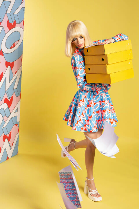
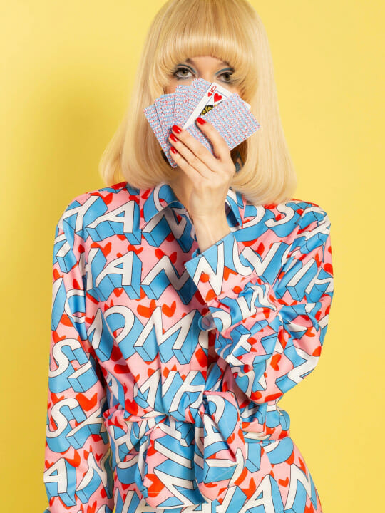
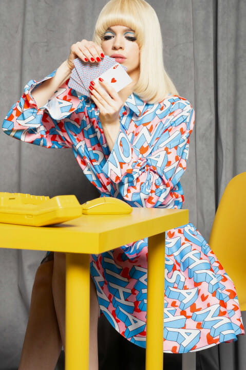
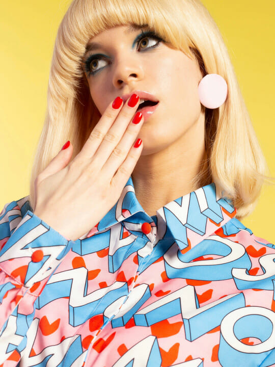
Have we become famous?
Before we get into the whole story, we want to let you know that there are some useful tips about print design in this article and we’ll eventually get to them.
But first…
Let’s rewind.
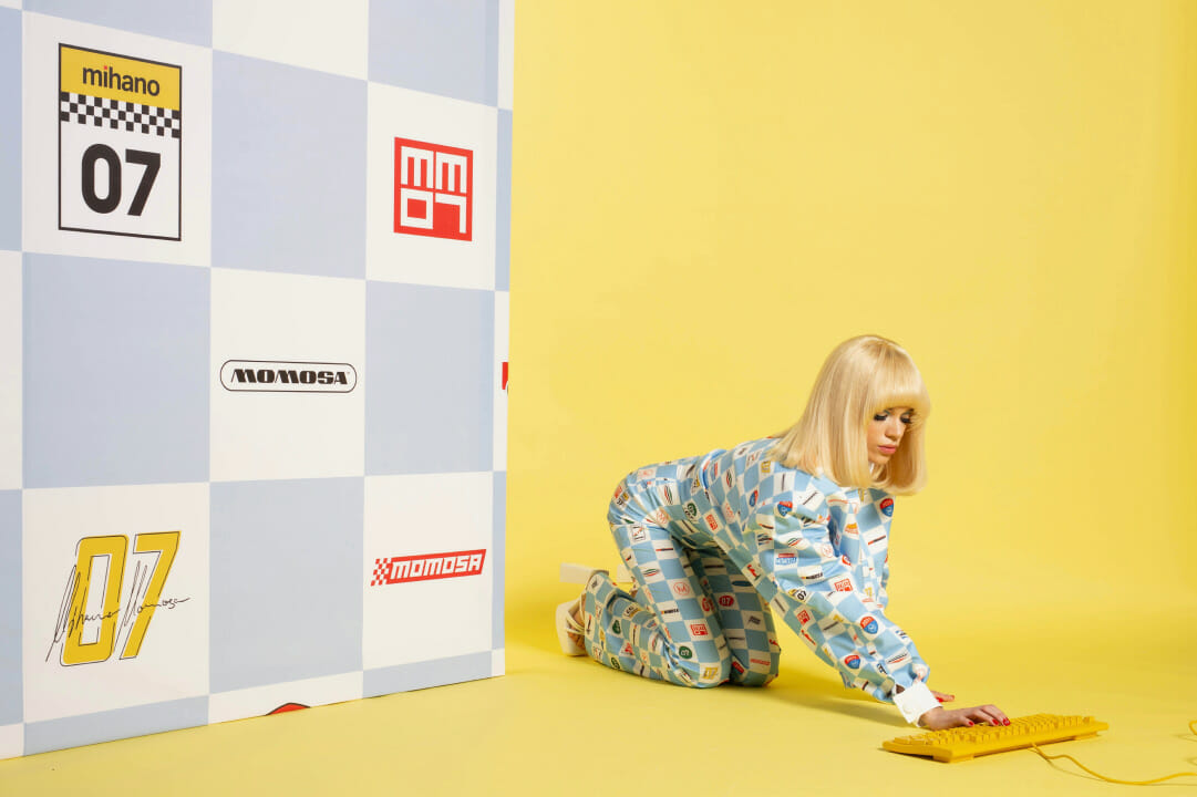
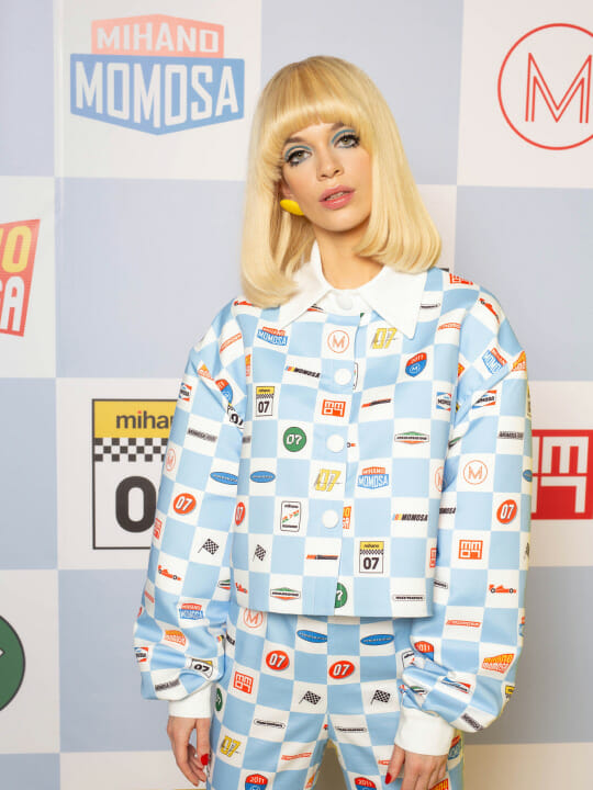
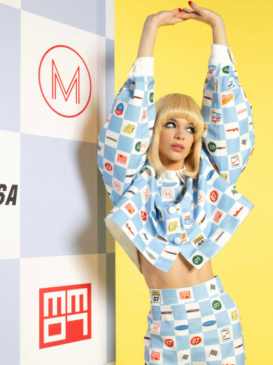
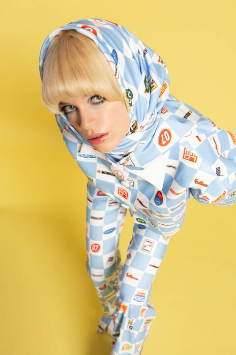
One morning, while the birds were chirping and the bees were humming – or was it our computers? – Mihailo (the creator and designer behind Mihano Momosa – the world famous fashion brand) came into our studio and asked us to do a fashion print design for his new collection.
Now, if you know this guy at all, it wont come as a surprise that his success is directly linked to his determination to bring to life exactly what he imagined. He showed us a couple of examples and described his thought process…
Then it was our turn.
We wiped off the initial sweat from our brows (that inevitably shows up when you talk to someone even remotely famous) and started brainstorming. What we came up with was a magic mixture of Mihailo’s ideas and our own (we’ll talk about that in detail a bit later).
So to answer the question – Have we become famous?
Well, not exactly but…
Okay, we might not be famous YET but we know a thing or two about fashion print design and we’re ready to share it!
*If you’re impatient and just want to see the nice pictures already, skip the next part and we’ll meet you at the end of the article! (Yes, we forgive you)
So, where were we? Ah, yes.
Here are 6 rules to keep in mind when designing textile print or creating a fashion print design:
*no. 6 is our favourite!
1. MEANING AND TARGET CUSTOMERS: Grandpa, that’s my Metallica t-shirt!
Before deciding on the types of fashion prints you want to go for, ask yourself what is the meaning behind the design. What are you trying to accomplish? Is your fashion print design going to attract attention or make a statement? Is the garment going to appeal to teenagers and youth with a wild and rebellious spirit or is it going to target a more mature type of fashion lover with its subtle floral fashion print design? Of course, you can bend the usual stereotypes and go big and bold and graphic for 70+. No judgement here.
2. FABRIC: Hang in there, it’s important!
We probably don’t need to tell you this – but just to be sure: A flowy, silky fabric isn’t going to hang the same way as a sturdy cotton or linen. Keep this in mind while you’re planning your fashion print design: smaller patterns and print look better on lighter, drapey fabrics, while bigger designs are more likely to look good on thicker fabrics. This is an important step, so don’t skip it.
3. COLOURS: Did Monet paint in black and white?
What is it you are trying to say? Fashion is, after all, an expression of personality, mood or lifestyle. It can be playful with vibrant hues or modern or vintage or simple and elegant. We won’t go into colour theory but there are a few tips to know when choosing a colour palette. Complementary colours are opposite on the colour wheel e.g. blue and orange or red and green. When paired together, they tend to compliment each other as the name suggests and draw the eye in. Analogous colours are any three colours next to each other on the colour wheel. There are multiple ways you can combine colours, as long as they are harmonious when next to each other. OR you can totally go wild with it and make your fashion print design something everyone will remember for its uniqueness.
4. WHITESPACE: Leave space for !
Do the components of your design look better when they are densely packed together or do they give off the vibe you want when they’re separated with a bit more whitespace? It’s your call, trust your gut. If it’s off, try to play with the distance between the elements in your fashion print design until the whole thing feels right and you have a balanced design.
5. SCALE: Size matters, okay?
Are the components you’re going for small in scale or large? Or maybe you just have one but aren’t sure how much space it should take up? If you’re going for loud and out there, choose bigger elements. For a more subtle look, go for a smaller pattern or maybe set the elements further apart. In the end it all comes down to the story and feeling you’re trying to convey.
Go back to the first point and decide who you’re designing for and what is the point behind it. There’s a big difference between drama and subtlety but sometimes all it takes is a change in size.
6. RULEBREAKING: The ultimate rule.
You didn’t think we’d let you go off without the mother of all rules, did you? If you need to write it on a post-it note and stick it to your computer screen or frame it and put it up on your wall or just spare all the tree cutting and make it last forever with ink on your arm, the point is: Please, we beg of you, don’t design anything blindly following the rules. Break them with intention – especially if it’s legal and you can get away with it! What you’ll be left with is a design that’s truly your own.
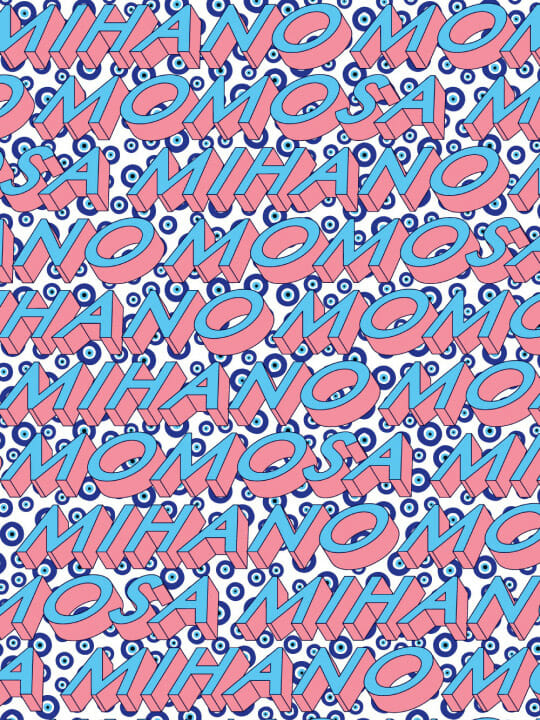
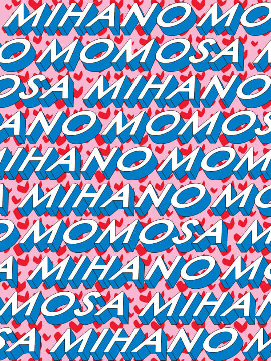
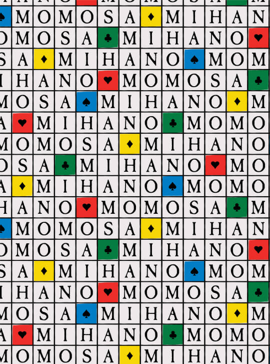
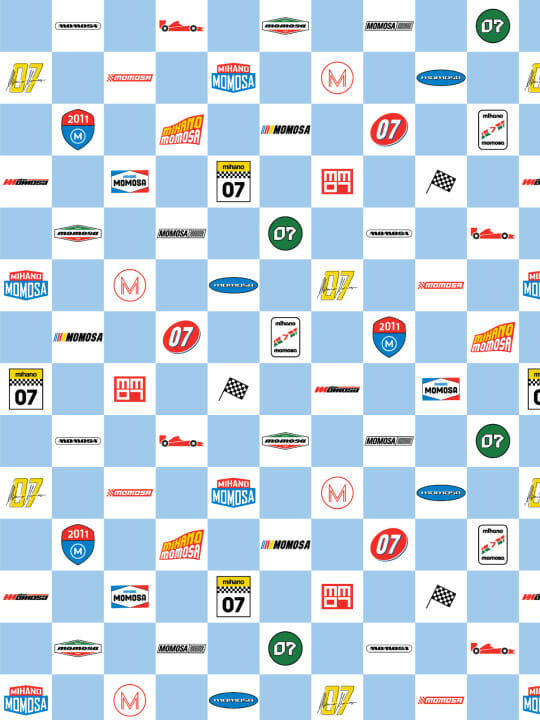
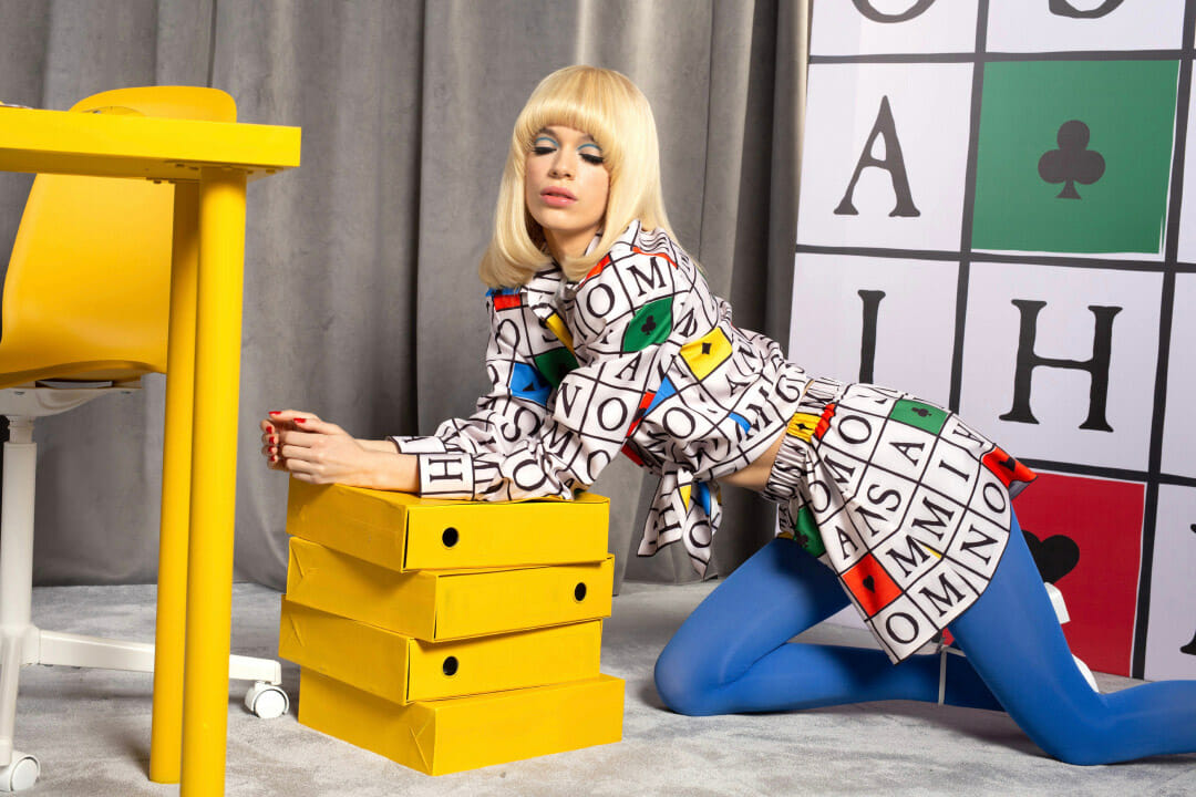
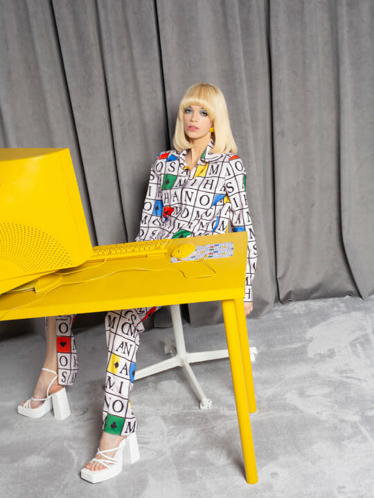
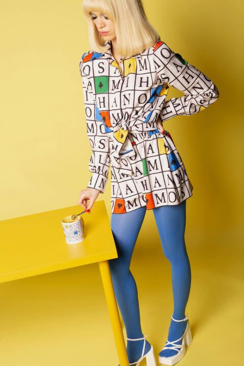
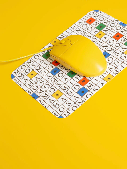
Finally, the cherry on top of this fashion print design cake: What we did for Mihano Momosa
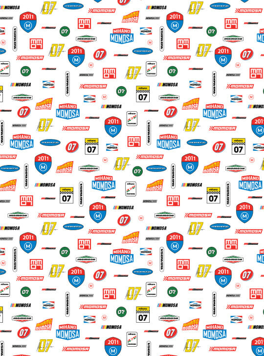
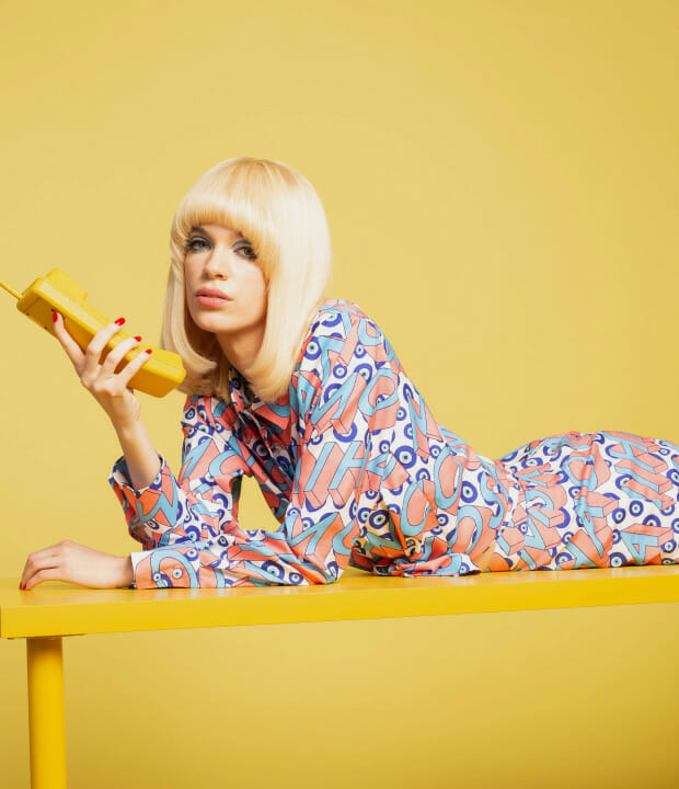
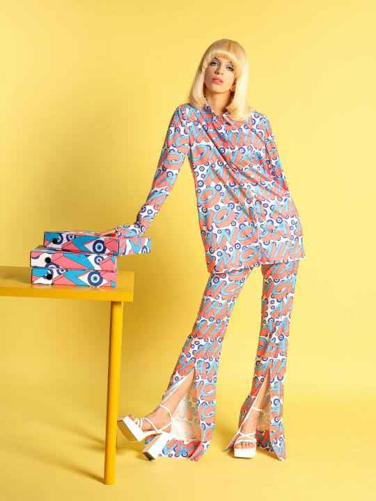
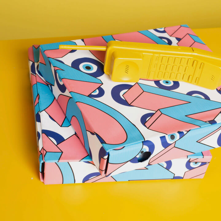
If by now you’ve googled Mihano Momosa, you know Mihailo never jokes around with his designs. We’d describe his previous collections as a mixture of sophistication and eclecticism, but the 2022 collection we’ve worked on together – is a bit different.